Web Developers: Your Navigation Bars Could Make Your Site Fail
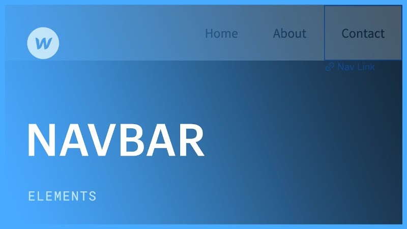
Website navigation is a crucial aspect of user experience, and this has a lot to do with where the interactive navigation elements should be placed. One of the most common strategies involve a menu bar at the top of the page because this is a placement that evokes the use of traditional Windows software, but once you incorporate "hero" images or slideshows, navigation bars can get tricky. One recommendation is to make the bar an overlay, but then you will have to be mindful of the images underneath.
With an overlay navigation bar, which is usually translucent, the effect is aesthetic and effective as long as the image is solid. The problem arises when clients have access to content management systems and decide to upload a hero image that is also translucent; this is more likely to happen when a slideshow is involved. One method that can be used to mitigate this effect is to code a gradient background on the navigation bar. The idea is to keep in mind that scrolling down the page can create a blur effect when the navigation bar and the images juxtapose, and this must be avoided.
Over the last few years, luxury automotive brand Lexus has published a very slick page for its annual design event, but even this example brings about the blurry issue. There needs to be a contrast between the navigation bar and the hero image, and this can sometimes be accomplished with shading or darker text. Perhaps a drop shadow will work in some cases, but the text labels of the navigation bar must always be readable.
Transparent navigation bars are tricky and should be avoided in most cases. If the scrolling of the page is going to create a blur effect, this could be a signal that the navigation bar should not be placed at the top of the page to begin with. Vertical navigation bars with icons instead of text labels may work out better, but they tend to be more complicated when it comes to responsive design and mobile devices. It may take a few mock-ups to get the placement and properties right, but it will be worth the effort in terms of UX. For more information click here https://www.reddit.com/r/web_design/comments/esa30z/opinions_main_nav_over_image_or_on_white_space/.