Typography Trends (2017)

Just as trendy colors change from year to year, so do typefaces. Remember when Comic Sans was cutting edge? And now, it’s relegated to grade school worksheets (or should be!) Nothing dates a graphic design or website faster than a passé font, so it’s never a bad idea to check in to an established webpage or design and spruce it up with a new typeface.
Handwritten
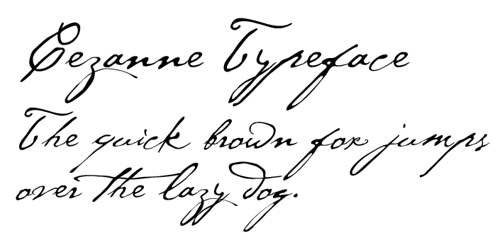
A font which brings to the digital world the warmth of a hand-written note is a nice touch, although it should probably be used as an accent rather than as a dominant typeface, as a little can go a long way. This sort of font can be used in an introduction to a section, or as an accent font for picture captions, creating a scrapbook-type vibe which could be effective on a website where you’re trying to establish an emotional connection with the visitor.
Hand-lettering is especially popular in the hipster genre of design, and pairs well with whimsical hand-drawn graphics and logos.
Mix and Match
It’s not always necessary to maintain the same typeface throughout a website or graphic design. In fact, a little variety can add the visual spice your design needs. You don’t have to trust to your own instincts; this site, for instance, does a thorough job of presenting you with 10 excellent combinations of free Google fonts (more about those later!)Don’t get carried away with variety, however; it’s a good idea to limit yourself to two or three different fonts in your design: one for titles, one for the main text, and one for accents (like those hand-written photo captions).
Go Bold!
Wide open empty spaces are a big design trend right now, but all that whitespace means that you need big bold typography to balance it out. Use a distinctive font which will get the visitor’s attention.Another current design trend is over-sized imagery that dominates the page. You need to have an equally dominant font to make sure that the text does not get lost in the visual noise. For instance, if the image is black and white, a big bright red title will stand out. On the other hand, with a colorful picture as the background, superimposing white lettering over top will help define the text visually. Is the picture light in tone? Then go with basic black!
Google It!
Google Fonts is an amazing designer’s toolbox that becomes better with each passing year.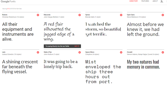
There are now 818 free open source fonts available for use by web designers, with more being added all the time. You can use them in a variety of sizes, from less than 10px up to over 100px. They work well on any size of screen, from standard desktop to mobile phone. As more and more designers use them, they will speed up page loading for users, as each font only needs to be cached once. As well, Google sends the smallest possible file to each user, so that less bandwidth is used.
Really, Google Fonts is a win-win situation for designers and users alike: designers get an ever-expanding pool of excellent open-source fonts to choose from, and users get maximum efficiency and speed with no loss of quality in their interaction with websites.