Try These Methods of Dividing the Space on a Page
Dividers have a place in modern web design. They separate content when white space isn't enough to separate elements. They organize content into clear groups, making a site more user-friendly. Dividers can be lines, white space, colors or images.
Lines
Lines are the most common dividers in web design, aside from white space. They are usually thin black, straight lines, but they can be any color or shape. You can find SVG lines or various graphic art websites or make your own with an online generator. You can make wavy lines as thick or thin as you like, in any color. Too many lines with make your site look dated.
Dividing lines are ideal for desktop sites, but they can take up too much valuable real estate on mobile apps. Using whitespace or color blacks make the interface less cluttered.
Whitespace
Using whitespace as a divider gives a website a clean, modern feel. Whitespace makes a site more readable and less confusing. If you look at Google's homepage, they use whitespace all around the one element they want to stand out; the search box. Too little whitespace can make a site look like one big ad.
Color
Blocks of color are effective dividers. They offer a visual hierarchy with bolder, brighter colors indicating important elements. Use a softer color for less important content. You often see long, one page websites divided into color blocks to make the site more digestible.
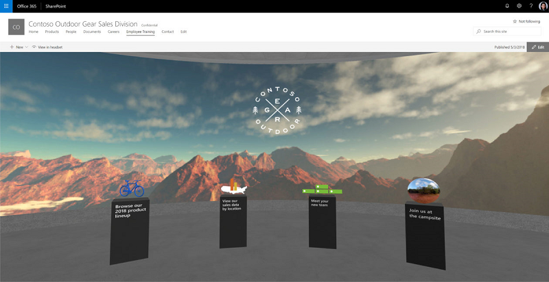
Images
Illustrations and photos make effective dividers. They break up walls of text and add fun to a content-heavy website. Images shouldn't fight the content for a visitor's attention.
The goal of any UI designer should be to create a site that keeps visitors engaged and makes it clear what their next step should be. You can achieve this with lines, color or images as long as you remember less is more. For more information click here https://www.shapedivider.app/.