Tips For Improving The Color Scheme Of Your Website
Choosing a color scheme for a website can be thought of as an involved field of study if one is so inclined, but not many web developers realistically have the time to approach this aspect of aesthetic design so considerately. In most cases, the designer would pick a generic color and then try to slightly modify it until he or she happens upon a satisfactory tone and intensity for that color. Even at this stage of the process, however, the designer can be tactical by thinking in terms of what would be different from the color-based brand identities of competing websites and how the color would complement the scheme of the website's own logo design.
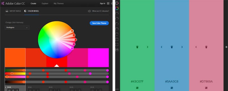
While a color-picking feature within an image-manipulation program like PhotoShop is what a designer who has settled on a general idea for a color tends to subsequently use, there are several online utilities that categorize variations of chosen colors to help users better estimate which variations should be picked. In the color section on the website dribbble.com, for example, bringing up a color-picking option shows a grid spanning fifteen columns. One can choose a basic color in the center row of this grid and decide on whether one of the listed colors above or below it ultimately serves one's own website's needs better; in general, brighter variations feel more energized and darker variations feel more professional and business-like.
These websites provide the chosen color's hexidecimal value so that the exact color can be brought up in other websites that exist to help the user formulate full color palettes. A palette in which the colors are efficiently complementary is best formed by adding no more than one distinctly different color to the base choice because too many colors easily result in a cluttered aesthetic design. The website paletton.com not only makes this step easy but also allows the user to pick a more muted color that looks a lot closer to the color gray than the base color but nonetheless has a matching tint to it. This is a good color to have text superimposed upon. For more information click here https://www.smashingmagazine.com/2016/04/web-developer-guide-color/.