The power of mobile website layouts and constructing them yourself
The rise of cell phones made millions of people ditch their landline telephones. Will the rise of the smartphone make people ditch their desktop computers as well? For obvious reasons, desktops aren't going to disappear anytime soon. Exploding numbers of smartphone users accessing the internet will affect web design, though. Websites continue to focus more and more on the mobile experience. Unfortunately, not all of these developments will prove positive for web design in general.
Looking At Today's Mobile Websites
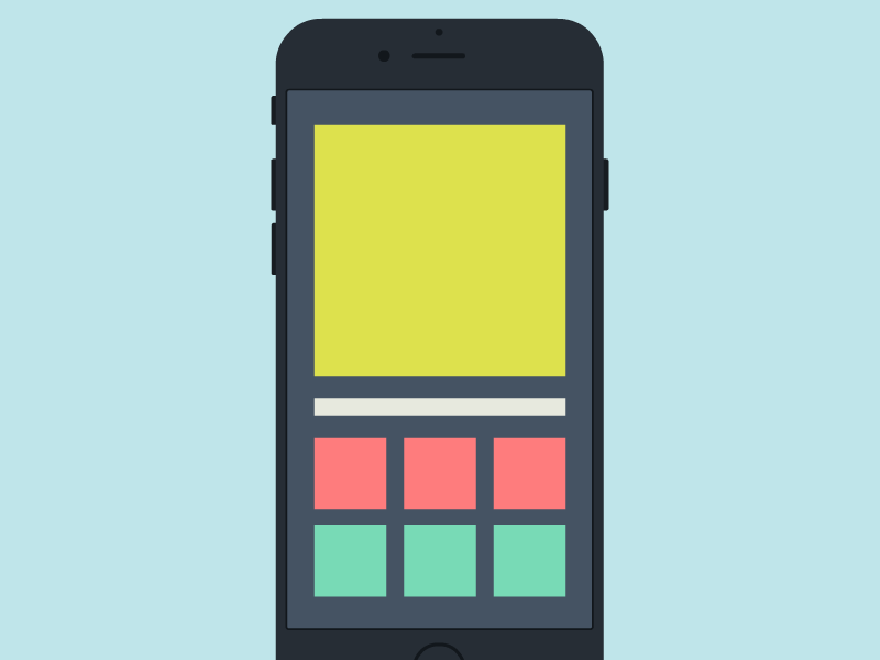
For better or worse, most of today's mobile websites look quite similar. Different backgrounds and color schemes cannot hide this fact. The basic template for mobile involves a logo banner across the top with a hamburger menu. Below those elements users will encounter content pertaining to whatever topic the website covers. When looking at news websites, it's hard to distinguish between mobile websites without obvious logos.
It's hard to blame web designers for how mobile websites look. Most smartphones range from 4.5 to 6.0 inches in size. While tablets feature larger screens, smartphones have seen the biggest boost in internet access figures. At such small screen sizes, designers don't have much room to work with. Mobile web design is limited by default, and innovating in this area requires a lot of creativity and ingenuity.
How Does This Affect Non-Mobile Websites?
As more resources pour into mobile web design, desktop web design will undoubtedly suffer. Less innovation will occur on regular websites compared to mobile sites. Developers and designers may attempt to push the boundaries of what's possible on today's mobile websites. On the other hand, traditional websites could hit a point where they remain stagnant without much innovation from developers or designers.
Web designers remain committed to traditional websites nonetheless. Today's mobile websites are much more likely to come from a bland template. For now, main websites will still provide the best experience when it comes to user interface and user experience. The tide could shift in the coming years as more and more people pick up their smartphones in order to access websites on the web. Every designer will have a different opinion on whether this shift is positive or negative. For more information click here https://www.reddit.com/r/web_design/comments/8etyzs/desktop_is_slowly_dying_and_i_feel_sad/.