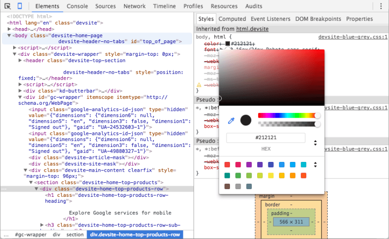
Surprise! Recent Chrome DevTools update allows new contrast ratio controls

Chrome's DevTools recently added the ability to finagle with the contrast ratio, improving visibility with some backgrounds. The addition seems to have come out of nowhere and has pleasantly surprised site developers who use Chrome for this purpose. It's important to note that every browser has its own version of "DevTools", not just Chrome; Firefox is the other well-known browser that's being referenced whenever this term comes up. However, it usually refers to Chrome in particular, and it's clear that Google's adding sweet little touches to their developer interface.
The contrast section comes with quite a bit packed in. You can adjust the contrast over a saturation range, input figures for the actual ratio and switch up the colors that are affected in such a way. It's a small, simple and wholesomely significant leg-up for the tech giant's browser — as if they needed more reasons to be number one. That said, there's a plethora of little design-related conveniences that are opened up thanks to this addition. No longer are you saddled with unwanted color schemes in order to find that sweet spot in the contrast ratio, and it's not that you couldn't get around this using other tools; it's just that you can do it right inside the browser now.
Firefox's DevTools doesn't have this feature yet, but users hope they'll take notice to Google's newest addition and follow suit. Other browsers either have this already or presumably have the feature in the works, but as much as it shouldn't be said, Chrome is probably the most important browser that it could've landed on. Not many people use Firefox's DevTools kit compared to Chrome, and the number of developers on Opera, Internet Explorer and others just tanks from there. As stated in the patch notes for Chrome, the update comes as a means of offering colorblind settings and contrast sharpening for those with poor vision. One guesses that Google cares about its users after all.
Of important note is that a degree of contrast is legally necessary for certain terms and conditions to be outlined on a website. This feature could help some users roll with the color scheme they wanted while adjusting the contrast to make it compliant. For more information click here https://i.redd.it/dmk0c09cb5x01.png.
