Responsive Site Designs Must Take the Site Content Into Account
To create responsive web designs that work properly on every device, it is important for web designers to think responsively. This means that they have to think much like a software developer and not focus entirely on visual presentation. Here are 5 tips for doing just this: 1. Use Responsive Templates
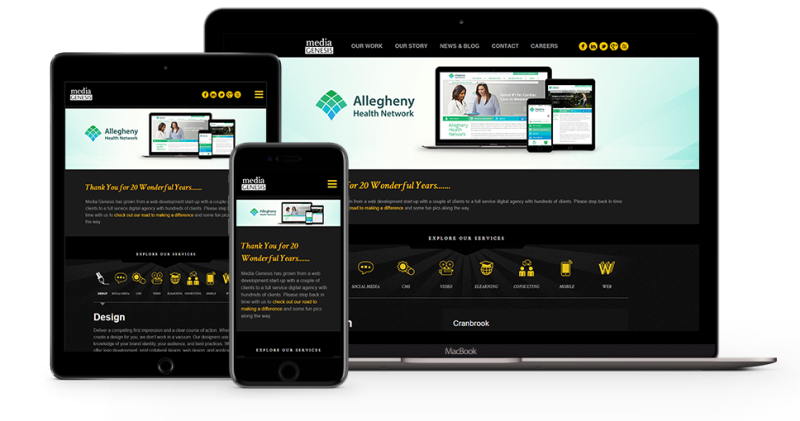
By using a template that includes desktop, tablet and mobile mockups, designers can force themselves to design with responsiveness in mind. They can see right away how their designs will work on all types of screens. A template also gives designers a method for stress testing their designs. 2. Stop Thinking in Terms of Versions
Prior to responsive websites, a mobile website was a different version of the desktop site. But today they are one and the same, and designers must understand this. They must understand that someone is not going to come in and make a mobile version of their design and that the mobile site is an integral and inseparable part of the desktop site. 3. Design with Content in Mind
Designers should not think of the visual design as being separate from the content it will display. Designs must account for any amount of content and characters, and designers therefore must use real data (or reasonable approximations) when creating their designs. 4. Stop Thinking in Pixels
Even when you design elements in pixels browsers will display these elements based on the width of the container. What this means is that elements become narrower when the width of the screen becomes narrower, so designers must make sure that these elements will work at a narrower width or come up with a breakpoint design that will be used in such circumstances. 5. View Your Designs in Browsers and on Real Devices
Designers should not make the mistake of viewing their designs only in mockups or on large displays. They need to see exactly what their users will see. This means viewing their designs in actually web browsers and on actual devices. They need to see their designs functioning in every possible dimension. For more information click here https://medium.com/owl-studios/responsive-design-af7a1f14b991.