Place Your Best Foot Forward with Thoughtfully Selected Fonts
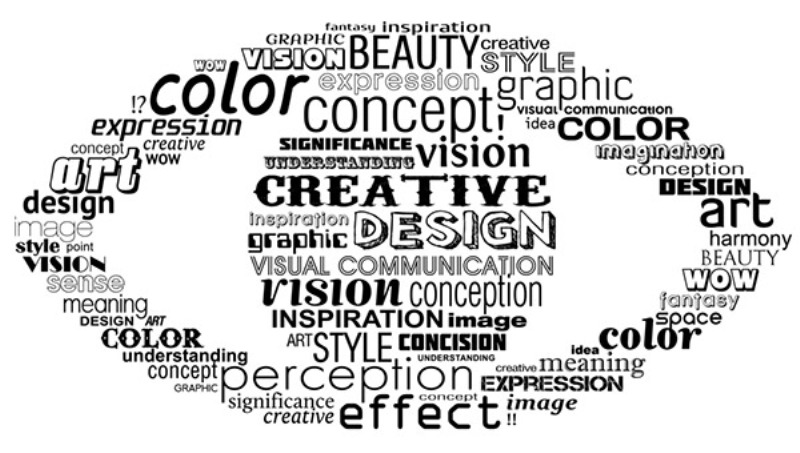
The Science and Art of Typography
There was once a time when workhorse fonts such as Times New Roman were the one and only way to go in just about every situation. The problem was a simple one: Not every system could be counted on to support the likes of fancier fonts such as Blabloosy, Blockhead, Futura, Averta and more. While some fonts work better with titles and headers, others can improve accessibility and immersion when used inside the body of your site text. In this day and age, accessibility is a large part of the user experience (UX) that ultimately improves your visibility from the all-encompassing vantage points called search engines.
The fact is, typography is a combined concept: a scientific and artistic pursuit, both parts joined at the hip and codependent but offering incredible potential when synergized. Just as important as the font is the phrasing, tone, style and tersity of the statements that you project upon your readers. You can certainly say whatever you like, but there's a golden ratio between what you say, how it's said and what font you use to convey it. Ironically, its principles are firmly emplaced upon virtues of simplicity and grace despite the unforgiving hard edges of the concept as a topic of discussion.
Keep It in Mind
Setting aside the fun stuff, there are a few straightforward rules that need to be cleared up. The success of your online enterprise depends on countless variables, but here are the main points you need to remember.
-
Typography is as much about aesthetics as functionality.
You obviously don't want to use over-the-top fonts for thick bodies of text. Subtler, more functional fonts are great for this purpose since they're easier on the eyes. -
Just about everything these days supports specialized fonts, so don't be afraid to try something new.
Almost every platform that accesses your site can use all of the fonts available to you. This means that none of your visitors will be alienated. -
Remember that amidst the uncompromising sameness of your competitors, the littlest difference can make you stand out.
Many sites today stick pretty uniformly to utility fonts, and that's okay, but you can capitalize on this by using something different.