Packaging Design Trends: Keep it Simple!
When the customer walks into a store with the intention of buying something, they are not going to be seeing your client’s product in the splendid isolation of one item on a shelf. Rather, they will see many groups of dozens of different brands, all arranged in solid blocks on the store shelves, whether it’s soup in the grocery store or shampoo at the drug store. It is your task, as the designer, to create a packaging design which will make your client’s product stand out amongst all the other visual noise. Just as silence in the middle of a crowded room can be a welcome relief, a package design stripped of busyness can accomplish the same thing.
However, creating an effective simple package design takes more than just slapping the name of the product onto a white box. The challenge of this design trend is using the minimal elements of text and color blocks to catch the attention of the consumer and still generate some excitement for the product.
What do we mean by simplicity?
A simple package design is one which is stripped down to just the essentials needed to make its identity clear to the consumer. Expect to see a lot of empty space, either white or a solid color, and a focus on text rather than pictures.
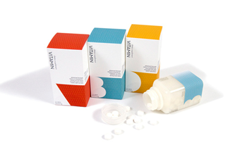
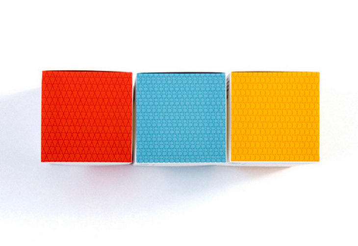
This series of vitamin packages illustrates this principle nicely. The different vitamins are differentiated from each other simply through the use of color and a simple representation of the A, B and D with a clever use of negative space. The preponderance of white gives the boxes and bottles a clean, almost clinical feel, wholly appropriate for something you’re taking to keep healthy. It inspires confidence in the medicinal qualities of the product.
Why simplicity works
Simplicity is a great approach to create effective product blocks on the store shelves. Without the visual interference of lots of pictures, text, and competing color, the strong contrast between white space, limited text, and bright color blocks will stand out from the crowd.
A simple package design is also easily modified for different items in the same product line. As seen above, simply changing the color and letter for each vitamin makes each one distinct, while at the same time maintaining the identity of the whole series of vitamins. The customer will easily be able to locate this brand on the store shelves!
Color it simple
Simple doesn’t have to mean white.
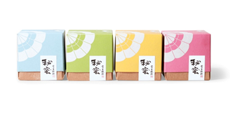
It does mean an uncomplicated design with an emphasis on solid blocks of color. See how effective a row of these boxes will look on a store shelf. Imagine them in groups of four of each color. Picture the labels with a simple typeface clearly identifying each variety of tea inside the box. This would also be a very cost-effective approach: the bottom half of each box is identical, so can be produced in larger quantities, lowering the cost. Only the top halves would have to be distinctive.
Make every word count
The choice of typeface for a simple package design is very important. Use a clean, uncluttered font. It does not have to be sans serif. For instance, using an old-fashioned typewriter typeface could be very effective. However, avoid fancy, flowing fonts. They will just add to the visual noise of your packaging design, and that’s exactly what you are trying to avoid. You probably also want to use the same typeface for both the big name and the smaller supporting text. This is not the place to introduce the complexity of two completing fonts!
You should limit the text on your package design. Keep the name big and bold, and the rest of it small and boiled down to the essentials. You aren’t using the words as your advertising medium. You’ve already attracted the attention of the customer with the package design, and you don’t want to interfere with the uncluttered appearance of all that empty space.
A simple solution for complicated times
A simple package design can stand out like a beacon in the jumble of visual noise on a crowded store shelf. The big and bold lettering, strong color blocks, and liberal use of white will make your client’s product pop out at the customer. This is a design trend which is here to stay!