Whitespace in Web Design: Leaving it Blank

Why Whitespace Works
Going for a walk on a snowy day in the country makes it immediately obvious why large expanses of white- or any neutral color- are effective: the white lets the elements of the landscape, such as trees, stand out in stark contrast to the snow-covered ground, whereas if there was instead a jumble of colors and shapes interfering with seeing the trees, the visual messages received by the brain would be mixed.
The same holds true on a web page. Just look at the most ubiquitous web page out there, the Google home page.
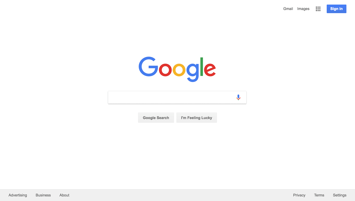
That page has a lot of white on it. In fact, it’s overwhelmingly white. The Google logo stands out, and the search term box is equally obvious.
Now, imagine what it would be like if the page you saw was full of bright colors and a jumble of images, à la Geocities circa 1998. The confused visual message wouldn’t help your brain figure out what you need to do at all. In fact, it would detract from the effectiveness of the message. That’s why the Google page works so well.
Using Whitespace Effectively
Whitespace, of course, does not mean just white: it can refer to the use of any one tone, or even a pattern, usually neutral, as a unifying background to a webpage, and used liberally to separate elements and create an elegant, restrained look. Just as a room with little visual clutter creates a welcoming space, whitespace can make site visitors feel comfortable as well.Whitespace works: a 2004 study found that “Use of whitespace between paragraphs and in the left and right margins increased comprehension by almost 20%.” While that applies to a text-heavy presentation, the principle can also be applied to web design where graphics are a major part of the layout.
One picture surrounded by a single tone can have a much greater impact than a half dozen crowded together on the screen. Users will not know where to focus their attention when there are so many different candidates. Instead, choose the one picture that tells the story or sells the features of a product the best, and just use that one.
How to Avoid Crowding out the Whitespace
Don’t worry about getting everything onto one screen. Users can scroll down, and will if the layout of the page leads them downward in a natural flow- something that building in whitespace to the design will make easy. Besides, given that the site visitor could be using any of a large desktop monitor, laptop, tablet, or smart phone to view the site, there is no way to predict how much they will be seeing on the screen at any one time, anyway. So don’t plan for a one-screen view: instead, make the top of the page inviting by leaving open spaces for the eye to rest on. Use the essentials. Only the essentials. Don’t crowd out the whitespace with unnecessary stuff. If you’re selling a product or service, tell its story briefly and effectively using well-placed text and images, and make sure that the whitespace helps your action items- the Buy button, for instance- stand out.Whitespace can make the difference between an okay web design and a stand-out site that will welcome visitors and lead them through the site narrative and achieve the desired result- an engaged customer!