MIT's Redesigned Website Is Less Sleek Than It Appears
MIT, one of the most prestigious tech schools in the world, decided to revamp their website's user experience to a more modern standard. The top of the page greets us with a search bar, in which users may find content within MIT's domain at an instant.
Although it is apparently minimalist with some fancy drop-down menus, the website takes up nearly one megabyte in space. This unusually high amount of space in a static front page is due to the lack of compression, which could reduce the download size to less than 100 Kilobytes.
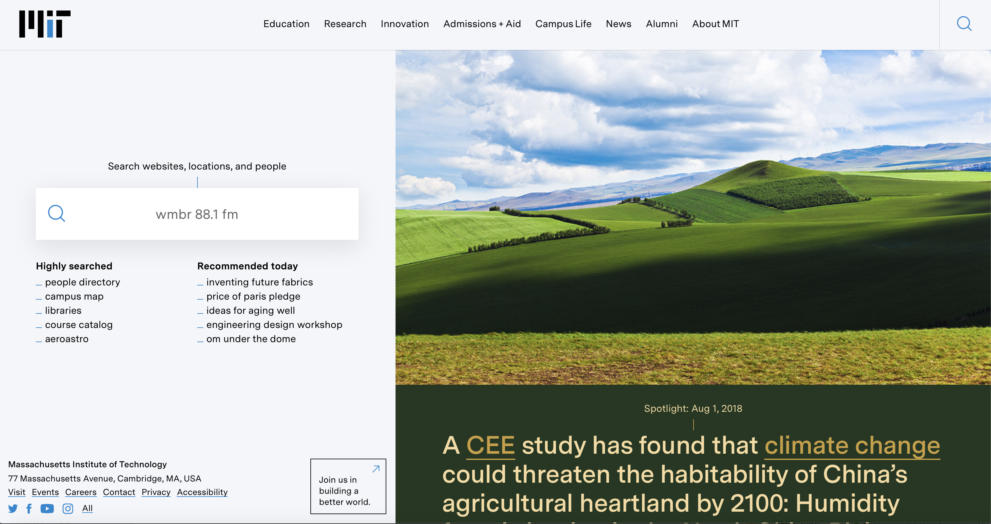
Another issue with the website is their large, high-resolution photo that does not serve much of a purpose. It takes up a little over 300 Kilobytes in space and is not compressed. The resolution is at 1600 by 1000 pixels yet the page does not even utilize the entire space. It could be reduced to a 100 Kilobyte image and still serve the same purpose.
Some users have reported receiving certificate errors, which may be triggered by forced HTTPS extensions. Defaulting to the regular HTTP version of the site makes it function normally. It is a bit surprising that a high-tech university does not seem concerned about enabling encryption for its users.
As for its overall look, it does the trick for a basic educational website. If you navigate to other pages on the domain, each has its own set of colors and styles. For example, research links are orange while educational links are green. On the education page, it uses neat separators that cut the page's paragraphs and subjects for an easier reading experience.
It does not appear to be a bad website by any means but the home page is not the most impressive to those that our web design professionals. It offers the bare minimum that one would need in a website without focusing on secondary aspects for the sake of aesthetics. For more information click here http://web.mit.edu/.