Make a Site Design Strategy Before Just Jumping Into It
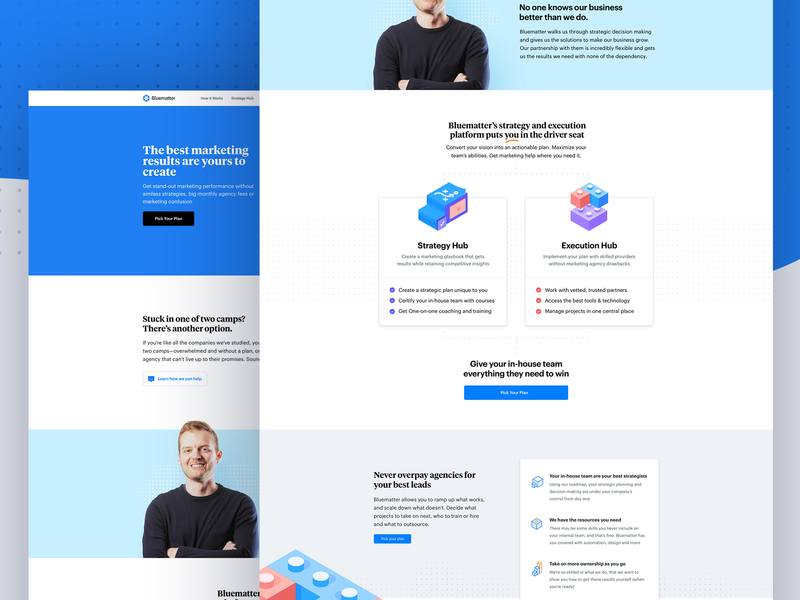
Figma is a design tool that is available as a desktop application like many other such tool suites; however, it is often praised by web designers for alternatively providing a means of visual interface design that is hosted within the cloud and executed within the web browser itself. While either form of Figma allows any individual web designer to create a digital design for a website using basic shapes and vector-based manipulations, one of its most widely touted features is how it facilitates a seamless cooperative environment between team members collaborating on a given project. It is used primarily to structure and realize the user interfaces of mobile apps and websites that are not necessarily among the most elaborate.
Regardless of whether a website or app created through Figma eschews clutter for simplicity, there are always specific factors about the project's design that designers can mistakenly handle in a less-than-ideal fashion without suspecting that there could be a problem. One might assume, for example, that a website meant to be viewed by users with desktop PCs can get away with having a minimal navigation bar in which the words representing the internal links are very small. Since some monitors are smaller than others and various users may physically need to keep a healthy distance from their screens, the navigation links should be relatively large in relation to the overall size of the landing page.
When it comes to strategically using clashing colors for style's sake, what can be appealing to the designer can easily be difficult for users to perceive. It is not uncommon for yellow text to be considered hard to visually separate from a peach-colored background, for example; if the designer considers this blend of colors important for their work's aesthetic identity, then various means of increasing the sense of contrast should be considered. Drop shadows may or may not work with the lettering, but Figma makes it easy to use drop shadows to make the content section of a web page appear to be hosted on a shape that is seemingly "floating" above a background pattern. For more information click here https://i.redd.it/1f00mclszre31.png.