Hygge in Graphic & Web Design

Making hygge work in graphic or web design:
Hygge (See Hygge on Wikipedia), the well-established Norwegian & Danish concept of warmth, togetherness, and coziness at home, has become a dominant design buzz word over the past couple of years, and it appears to have considerable staying power. While it is primarily associated with home décor and interior design, there are lessons in the aesthetic of hygge that translate well to web and graphic design, and given the current popularity of hygge, using some of these elements will give your designs a current appeal!The essentials of hygge
Hygge is all about simple, warm pleasures. Two experiences that seem to sum up the hygge are a candlelit family dinner around a rustic table, and wearing warm, woolly socks next to a wood fire, in the company of good friends. It’s strong on the artisanal, home-made feel, far from the mechanized, industrial world that is so omnipresent in our 21st century society.Using the hygge essentials in design
This picture seems to sum up so much of what hygge is. This thatched brick cottage, surrounded by informal plantings of greenery in its rural setting, exudes welcoming warmth and down-home simplicity.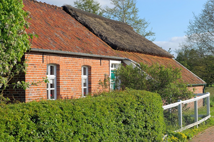
Hygge pattern and color
This mouth-watering picture says it all, doesn’t it? Delicious, simple, food close to nature is a hallmark of hygge. Imagine using the colors red and creamy white, with a brown background to keep it anchored, to bring that homey, natural feel to your design. It’s a muted feel, even with the use of red.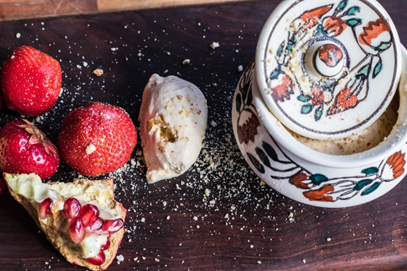
Either way, avoid an over-finished look. The charm of this design concept is in the slight waviness of a hand-drawn line, or the color spilling out past the outline. Without overdoing it, celebrate the imperfections, because that is what makes it hygge.