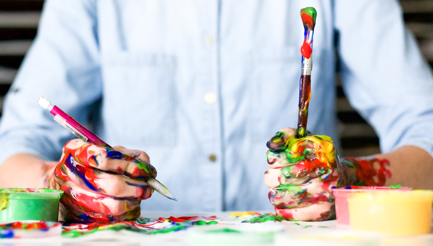
How to use color in graphic and web design
Setting a Mood
The colors that you use will influence the emotional response of the user. For instance, if you want to establish a calm, contemplative mood, you are obviously not going to go with bright, jarring shades of red and orange. Rather, you will opt to use subdued, soothing blues, lavenders, and grays. On the other hand, if you want the user to be excited about whatever you are presenting, go for that red and orange!
Make it Monochromatic
When choosing which colors will go well with each other, you can never go wrong with a monochromatic scheme.
Using different hues of the same shade will instantly create a unified palette on the page or screen. It’s a subtle way to create visual interest: while the same color is used throughout, the variation in tint gives life to the design.
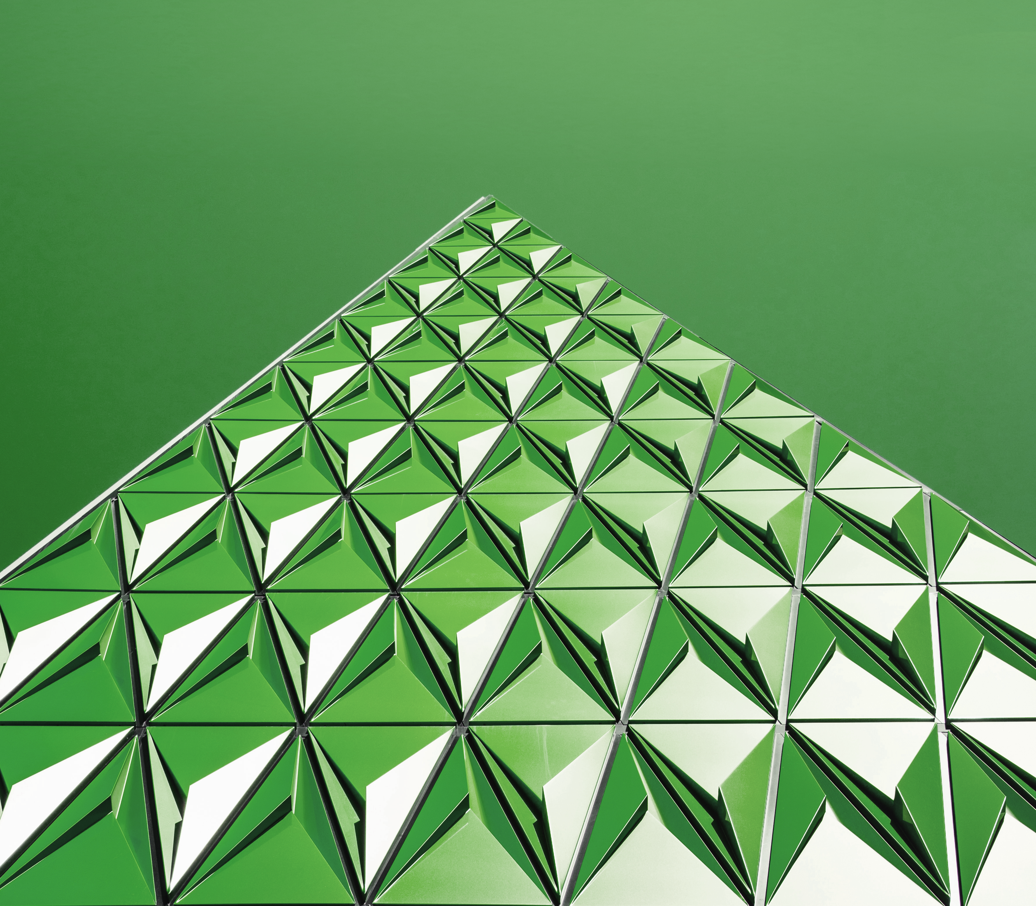
Punch up the Contrast
On the other hand, using contrasting colors will create excitement on the page, but you need to be careful to use colors in the right combination to achieve the right effect.
Let’s say, for instance, that you want to add a color to your green palette to spice it up. You might draw inspiration from a picture to help you choose an attractive combination. For instance, lavender blue and green are a classic combination from the natural world:
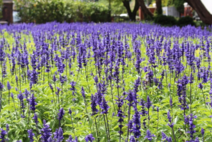
What a great pairing of color! Since green and blue are next to each other on the color wheel, this analogous pairing is low-key but more dynamic than a monochromatic green palette.
On the other hand, going right across the color wheel brings you to green and red, which is a much more brash color combination. You have to be careful when using a color combination with this high a contrast, as it can easily be too overwhelming. However, when you want to really grab your audience’s attention for a brief time, this is the way to go.
Following the Trends
It’s not enough to mix and match your colors to come up with a good combination. You also have to keep up with color fashion. Few things date as much as a color trend. It’s easy to pick out an item of decor from the late 1980’s, for instance, by its use of dusty rose and hunter green. The use of current color trends makes a big difference in the appeal of graphic and web design.
The most authoritative color forecast is that from Pantone, and they make it easy for designers in all areas, from fashion to web design, to know what colors are most likely to appeal to the public at large. Their seasonal color forecasts will give you a heads-up on what both your client and their customers are likely to want to see in a graphic design or web page.
Let Color Work for you!
Color can attract attention, set a mood, or tell a story. Understanding how to use it effectively in graphic and web design will make you a designer who can better serve their clients. Spend time with the color wheel and search out combinations in nature, art, and everyday life that will help you to achieve that goal.