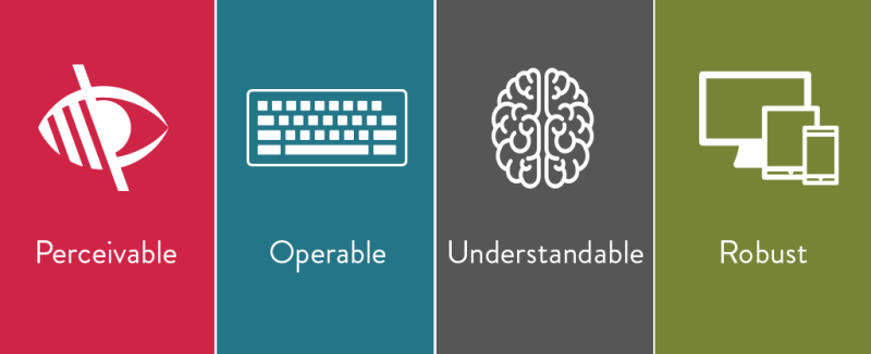
How To Make Websites More Accessible For The Visually Disabled
Business start-ups sometimes realize too late that the designs they give to the websites representing their companies' services can actually expose them to the risk of being sued. This is because any commercial entity such as one that does business online is technically bound to the standards set forth by a piece of legislation published in 2010 by the United States Department of Justice. This act, the Americans with Disabilities Act, holds that any service that provides information electronically must be as readily accessible to persons with impairments as to those without them.
Currently, the details of what exactly the act regulates about websites' designs are not formalized and strictly enforced, which makes it uncommon for a company to be sued on account of its official website being overly difficult for disabled customers to read and understand. Nonetheless, business websites should regulate themselves in accordance with the act by incorporating various common measures of inclusive content presentation.
For example, blind customers obviously use programs that read the text-based content of websites out loud to them. As such, they are not in a position to knowingly bypass the top portion of a given page and immediately start listening to that page's unique contents if they arrive at that page via a link. Therefore, the beginning of each page's contents should include an anchor so that the customer does not have to hear the program recite the terms featured within the navigation bar every time they start listening to a new page.
Since a blind user cannot see any images included on a page and must rely on the contents of their alt tags to understand what they are, each image's alt tag should feature a detailed description. All fields on an online form should include label and title tags for the same reason, and it should also be easy for a blind user to highlight any button or form field by pressing the "tab" key. The ADA also recommends increasing the contrast between the background and the text in front of it to make the text easily legible for other viewers. For more information click here https://www.reddit.com/r/web_design/comments/ajr372/ada_compliance_websites/.