How To Build a Responsive Website Even If You Can't Use Media Queries
Building Responsive Websites Without Media Queries
One of the tenets of developing responsive websites is to start things off with media queries; after all, you want to know the display properties and capabilities of the devices visitors are using before pulling out adjustable code magic. There are ways to avoid media queries with cascading style sheets, but the true value of choosing this strategy is dubious at best.
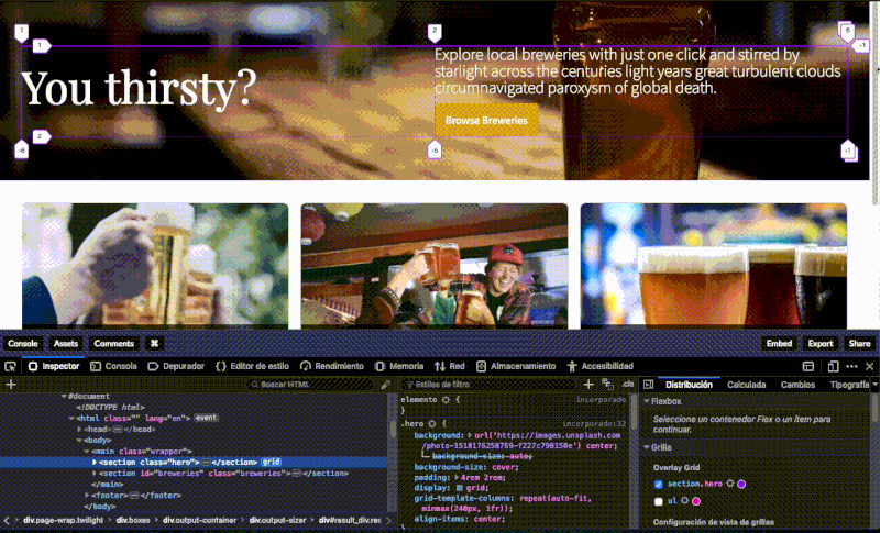
With CSS elements such as grid and flexbox, 13 lines of code will result in four layouts; while this will not cover every single device in use these days, it is a pretty clever way to avoid media queries, and it is also an elegant piece of coding. This was recently shown by the folks at Polypane, a neat app that acts as a special browser for web developers who wish to see their projects in multiple viewports. It makes sense that Polypane would show off such CSS tricks, but there are limitations in this regard. The Polypane example included a couple of text boxes and a submission button; this is clearly not enough to justify doing away with media queries because most projects will present greater complexity.
There is no question that flexbox is powerful, but it should not convince developers to ignore media queries. Trying to do away with such queries on projects that are more complex than just a few elements is not a good idea, and this is something that can be clearly shown on the Polypane app.
Instead of trying to get around media queries, a better approach would be to learn all that can be done with them; for example, the logical operator "if" is the basis of all queries and it is implied, "and" separates the maximum and minimum widths, commas should be treated as "or" operators, and so on.
Since media queries appear early in the CSS code, it pays to review everything that the Mozilla MDN docs have to say about them. Queries are followed by feature rules that are reasonably easy to understand and learn. As CSS progresses and more libraries are developed, there will be more neat tricks for simple projects that will not require media queries, but playing it safe and including such queries should not be dismissed. For more information click here https://polypane.app/blog/4-css-layouts-without-using-media-queries/.