Menus Belong on the Bottom of the screen for the new iOS X.
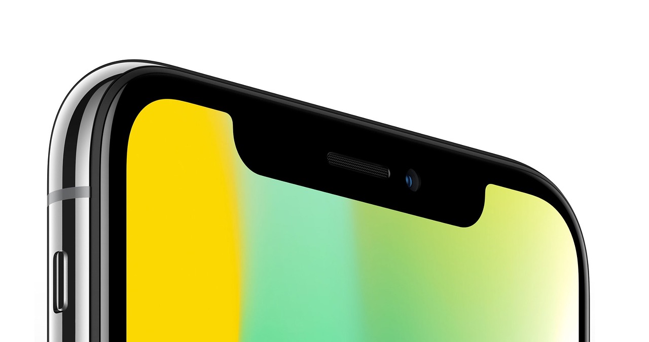
With the iPhone X being released with innovative software, most websites have designs that do not keep up with mobile trends. Daniel Korpai from Dribbble had stated that most websites are still using "hamburger menus" for users to navigate to different categories, which is not convenient for mobile users that are browsing with one hand.
Floating Bars
Creating floating bars for websites will not only be convenient for desktop users but especially for iOS X mobile viewers. With the latest OS from Apple, the screen is bigger yet it lacks the ability to easily navigate websites at the touch of a hand. Ideally, a designer would want to implement the floating button towards the bottom of the screen as most users are fixated at the top and middle of their screens. Although it may block content and make users scroll down, it is a trade-off for the convenience that it offers visitors.Decreasing Bounce Rates
Having navigation links always in the users face will encourage them to visit other aspects of your websites. A user coming in from Google or a social media link will likely just read the content and move on elsewhere. Catching their eye with relevant links will increase regular followers and give your website some extra views.As Daniel Korpai's example solution suggests, it is better to put a menu button at the bottom of the screen so that it may interact with the navigation elements with just one finger. It is great for a website to plug contact information or a CTA in which the user will easily be able to take action instead of getting disinterested and bouncing. This type of solution is ideal for people who are walking whilst browsing so that they have a means of interacting with just one hand.