Flat UI: Will It Work For You?
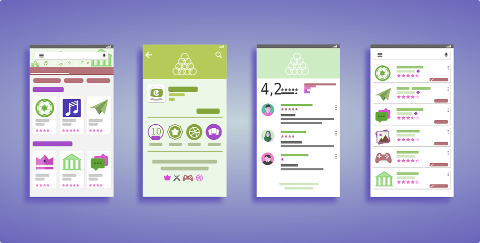
What is Flat UI?
Flat UI is all about the beauty of simplicity. It is a minimalist webpage design that:
- eliminates 3-D effects such as gradients or texture
- uses simple user interface elements such as buttons
- uses color blocks of bold, monochromatic hues without shading
- illustrates with icons or simple drawings
- uses a sans-serif, clean-lined font
In other words, it creates a clean, bright, easily navigated site with a minimum of visual interference.
Why is Flat UI an effective web design?
Flat UI is a very user-friendly design. By eliminating visual complexity, and using non-text elements such as icons wherever possible, it is easy to find your way around the webpage. The bright, clear colors pop off the screen at you. It also adapts well to different-sized screens, from a large desktop screen to a small mobile device. Because of the simplified images, the site will load faster, always an advantage when people easily get impatient with a slow-loading site.
Color
The colors used by Flat UI designers are very important to the feel of the page. It is very common to see the retro shades of pastel turquoise and salmon, for instance, being used together. Brighter shades of red, blue, purple, orange and green are also popular. Monochromatic color schemes can unify a web page, with contrasting colors being used to help the user identify elements such as buttons or links. Usually these colors are used against a white backdrop to create a clean, crisp look. You can find many online resources to help you choose colors that work together well to create a bright, inviting web page.
Typeface
The choice of font for a Flat UI web page is important. Without all the visual complexity of a traditional skeuomorphic page, a sharp, distinctive font will add much of the visual interest. Most often we associate a sans-serif typeface with Flat UI design, but there are exceptions to that rule. It is important to limit the number of different fonts that you use; probably two is enough. There are many sites out there with free typefaces that are well-suited to Flat UI design.
Icons
The use of stylized icons is one of the most recognizable elements of Flat UI design. They’ve taken off from the web page and onto advertising platforms such as billboards and even the backs of trucks! Their advantage is that their uncomplicated, easily understood design does not depend on text to convey information. They can be universally understood, no matter what language the site is written in. As an example, we all immediately equate an envelope icon with email, whether it’s used by Gmail, Outlook, or Apple. Given the thousands of stock icons available for free, a Flat UI designer will have no trouble finding just the right ones to convey the needed information or user cues.
Layout
A well-planned layout is key to a successful Flat UI web page. This is where your use of color can help you clearly mark off each section in color blocks. Sometimes employing clean, crisp border lines to divide the page up will do the trick. Whatever approach you use, you want to avoid a jumble of icons and competing colors which will not give your user a clear sense of where to go next.
The Biggest Flat UI Problem: Identifying Clickability
One common frustration with Flat UI is that it can be difficult to identify where to click. Skeuomorphism has more tricks at its disposal to clearly indicate buttons, including 3-D effects which make buttons appear to be raised. When everything is flat, other visual cues have to be employed. If the only way that a user can identify a clickable element is by mousing over it, then the design needs to be improved. Designers can use arrows, underlining, or highlighted text to make links clear. Buttons can be a different color from other blocks to make them stand out, or have rounded rather than sharp corners to differentiate them. Using text such as “Buy Now” or “More Information” on a button will make their function clear. Some designers are even tweaking the format by adding tiny bits of skeuomorphism - very minimal drop shading can make a big difference in identifying buttons as opposed to static icons.
The Future of Flat UI
Flat UI is here to stay, but it is not suitable for every site and purpose. A site which needs to create a deeper engagement with its users, such as an online role-play game, or a children’s activity site, would find a Flat UI design far too limiting. Its real utility and strength is in sites whose purpose is to convey a fairly straightforward message in a concise manner. It’s not a format where a user is going to want to linger for a long time because by definition it is going to be limited in the depth and complexity of the content. But if you want to tell people what the weather forecast is, or help them make a quick online purchase, its simple format, clean crisp presentation, and iconic visuals make it a great choice.