Creating a Design Style Guide
Why Create a Design Style Guide?
When you have a variety of different people (or even just two!) working on various elements of your brand identity, it’s important that everyone is all on the same page. Or pages. As in, the pages of your brand identity style guide. It’s a great way to make sure that the public sees the same design elements being used in all media, whether it be online, on paper, or on a sign.This includes not just your logo, but also the colors used, the font, and even preferred poster layouts. One excellent example of a comprehensive style guide is the one for London’s Kew Gardens. Jamie Oliver’s style guide also is very thorough.
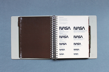
Historically, organizations like NASA have protected their brand identity with very thorough style guides. In the 1974 style guide, you can see the logo being presented in various sizes to show designers of NASA material what they had to use.
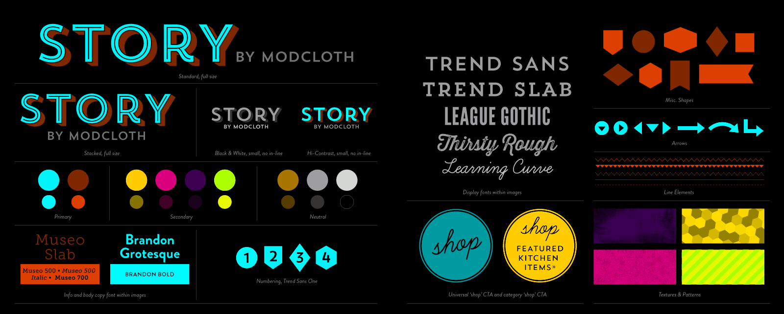
This example for a woman’s clothing company shows the whole thing on one page, from logo to font to color choice.
A rebranding of a product or organization should really be accompanied by a complete style guide so that the resulting new image is presented in a consistent and coherent manner to the public.
Logo Design
Look again at the Apple & Eve style guide. You can see that various sizes of the logo are provided to allow for its use in different contexts. A good style guide will mandate the minimum and maximum sizes for a logo, as one that is too small could lose important detail, and if is too big there might be undesirable distortions. It even provides examples of what cannot be done with the logo to make it perfectly clear to a media designer.The options available to a website designer are more varied than for a graphic designer. For instance, it is possible to incorporate animation into an online logo, whereas the paper version has to be static. However, taking advantage of the extra possibilities of the online environment does not mean ignoring the brand style guide. A good style guide will include online versions that conform to the broad design mandates.