Color Choice in Product Design
Making the Right Color Choice:
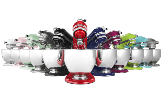
I think that we would all agree that a lipstick brand that did not include several shades of red would soon find itself in the discount bin. Choosing the right colors- or range of colors- for a product line is as important as any other component of the design process. We have such visceral- and individual- reactions to color that it’s important to give customers some choice when offering your product to the public. Even the iconic KitchenAid stand mixer is available in a rainbow assortment of mouth-watering colors!It’s important to keep color in mind, whether you are designing a product or a graphic or webpage design.
Red
Red is a high-energy color which also denotes high status, as in rolling out the red carpet. It’s a popular accent color, especially in kitchens and dining rooms, where it is believed to stimulate appetite. Thus, it’s a natural choice for products for use in cooking or eating. Used in a visual design, too much red can be overwhelming, but used to provide a pop of color, it can make a big impact.Blue
At the other end of the spectrum, blue is a soothing color, which is often used in bedrooms and bathrooms, for its connection with both sky and water. In graphic design, a light blue can make an excellent background as an alternative to stark white.Green
Green is the color of the year 2017, so it is definitely a popular choice in product design right now. Just as green grass and foliage can coordinate with any color in nature, indoors green can tie together different colors. In graphic and web design, green creates a calm, natural vibe. It’s the perfect choice for a website related to health or wellness products or services.Purple
Purple is historically the color of royalty, and it retains the associations with luxuriousness and wealth today. It also creates a sense of creativity and fun, so is used in children’s products. The counter-culture hippy vibe created by its popularity in the sixties makes it a good choice for products designed to appeal to the nostalgia of aging baby boomers.Black
Black is a very common choice in product design, and with good reason. It’s neutral, and at the same time has an association with high quality with consumers. Often, luxury brands are designed and marketed using black. Among younger consumers, it’s a natural choice for electronics and accessories such as earbuds. If you are looking for a color with a broad appeal for product design, black is a sure bet.In graphic and web design, black makes a great backdrop for photographs and graphics. It provides visual weight without taking the attention away from the important elements on the page.
White
White conveys cleanliness and purity. In product design, white is universal; no matter what a person’s preference is, white will coordinate with it. For instance, whether a bathroom is blue, red, or green, white towels will look just right. If a towel manufacturer was to limit production to just one color, white would ensure the highest sales. White is also identified strongly with high-end electronics such as Apple products, so a similar product also available in white would benefit from those associations.In graphic and web design, white is the ultimate neutral backdrop for content on a page. Depending on the colors used with white, you can create an atmosphere of professionalism (black, grey, and accents of red and blue, for instance), or casual fun (oranges, reds, purples).
You’ve got a whole toolbox of colors out there to make the right impression. Whether designing a product or creating a webpage or graphic design, choosing the right color can make the sale!