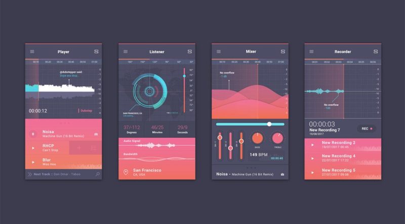
"Blinded by the white: Dial down the bright"

One fairly basic principle of user interface design is to avoid implementing brightly colorful backgrounds on websites. Many people will appreciate website designs with more comparatively muted colors and contrasts for reasons that are quite literally physical; the human retina exhibits a straining sensation within the eye if it is trained on a very bright surface for some time. Visual elements that are brighter and bolder can be tactically incorporated into portions of a user interface to take advantage of the fact that the eye naturally draws its attention to them because of how bright colors stimulate the retina. However, an entire screen filled with that color will stimulate the retina too much for the eye to want to remain looking at it.
Tuning a background's color to a tone that is literally easier to look at is not always a matter of simply adjusting a brightness value. As far as image-adjustment programs like PhotoShop are concerned, increasing the brightness of an image is carried out by mixing the color white into the image's contents, and decreasing the brightness is carried out by the same process but using the color black instead. However, a darkened image's color scheme will still appear to be "bold" in relation to its overall brightness if it has not been desaturated; decreasing or increasing the saturation of an image involves either mixing the color gray into the image's contents or taking the gray elements out of them.
In user interface design, the viewer should be shown screens that are not overly bright as a whole, have fairly desaturated backgrounds spread across most of the page, and have specific elements such as buttons made brighter and more saturated in their colors. A user interface designer that has settled on a core color for a project should create various adjusted forms of that color in terms of brightness and saturation and label them for easy reference while searching for the best final background color for that project. An ideal background color tone usually has both its brightness and saturation values below their default levels.
For more information click here http://uxmovement.com/content/why-you-shouldnt-use-bright-saturated-colors-for-backgrounds/.
