Are Solid or Outline Icons Better For Humans and Search Engines?
A recent article about user experiences asked the question about icons and which ones are faster to recognize both for people and for search engine crawlers. The author of the article was trying to get at whether solid icons or outline icons are a better choice. A lot of people weighed in after reading the piece.
Most of the people who spoke up noted that it depends on the background style and color and the icon's color as to which type is faster to recognize. A busy background with vibrant colors and an icon that is small with a muted or black color could be difficult to recognize. On the other hand, a plain and light-colored background paired with a solid, dark icon is easy to recognize.
Several people also pointed out that solid icons could take away attention from items that are higher up in a hierarchy. A lot of people brought up differences between monotone colors of icons and backgrounds. Monotone colors and backgrounds are not easy to differentiate. The contrast between colors may be more important than the idea of an outline of an icon versus solid icons.
There was some disagreement between people who commented about how important the color of the icon is. Someone suggested that yellow is the color that people recognize the fastest. Most people can see the color yellow, even if they have red-green color blindness. This person wondered if school buses are yellow because people recognize that color so quickly.
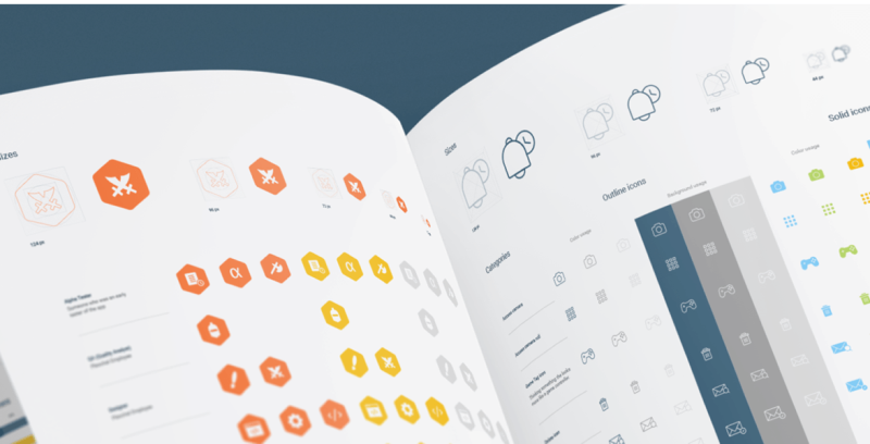
Other people brought up the shape of the icon and its importance. For example, stop signs in the United States are hexagons. Information signs about railroad crossings are diamond-shaped, and other signs such as speed limits and information about nearby things such as hospitals or parks are usually rectangular in shape. The shape of the icon could also be important. If your brain is trained to respond quickly to a hexagon shape because you drive every day, then you might want to think about using a hexagon in order to make your icon stand out from other information on a page. For more information click here https://uxmovement.com/mobile/solid-vs-outline-icons-which-are-faster-to-recognize/.